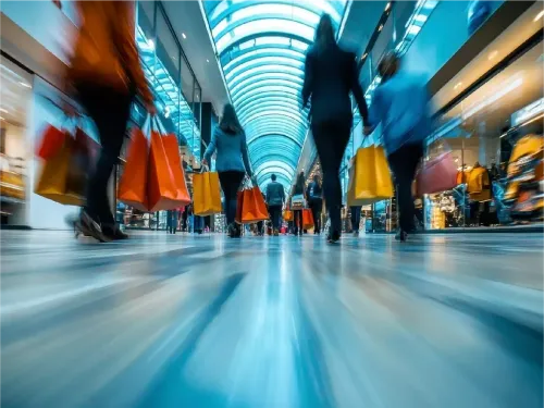
People Counting
Trusted by Global Industry Leaders


Why People Counting Matters?
Optimize Operations
Allocate staff and resources precisely using real-time visitor density data.
Boost Sales & Conversion
Correlate traffic with sales and improve in-store conversion by up to 12%.
Enhance Customer Experience
Reduce congestion and streamline layouts based on live occupancy.
Ensure Safety & Compliance
Monitor real-time capacity to meet health and legal regulations.
Cut Energy Costs
Automate lighting, HVAC, and signage by aligning with visitor presence.
Make Data-Driven Decisions
Use accurate people counting to drive business strategy at every level.
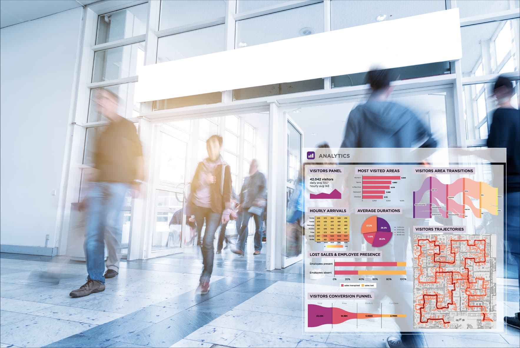
Ariadne's AI-Powered People Counting Solution
Ariadne's next-generation people counting solution uses Wi-Fi signals, AI algorithms, and proprietary analytics to track visitors with over 95% accuracy anonymously and in real time.
Key Features
Real-Time Analytics
Live dashboards for entries, exits, and zone occupancy.
Staff Exclusion
Automatically filter out employees for true customer-only counts.
Privacy-First Approach
100% GDPR-compliant and no personal data collected.
Predictive Analytics
AI forecasts peak hours and visitor trends.
Heatmaps & Flow Tracking
Visualize traffic patterns and customer journeys.
Omni-Channel Insights
Combine offline traffic with digital marketing impact.
Custom Dashboards
Filter data by location, hour, product zone, or campaign.
Automated Reports
Receive daily, weekly, or monthly performance summaries.
Industries
Retail Stores
- Optimize store layout and employee scheduling.
- Analyze visitor journeys and increase conversion rates.
- Identify top- and under-performing areas by zone.
- Use dwell time analytics to enhance product placement.
- Measure ROI of in-store promotions and footfall changes.
Airports & Transportation Hubs
- Track passenger flow to reduce congestion.
- Improve staffing at check-in, security, and gates.
- Enhance terminal layout based on crowd data.
- Manage parking and transit more effectively.
- Ensure real-time safety and emergency readiness.
Smart Cities & Public Spaces
- Track pedestrian density to improve urban planning.
- Optimize transport schedules with live foot traffic data.
- Analyze public events' impact in real time.
- Improve public safety with live movement mapping.
- Manage restricted zones with smart access insights.
Shopping Centres & Retail
- Optimize tenant placement and common-area layouts based on foot-traffic heatmaps.
- Measure flow between anchor stores, corridors, and specialty boutiques.
- Identify peak hours in different wings to tailor opening hours and promotions.
- Analyze dwell time in food courts, lounges, and event spaces.
- Evaluate mall-wide marketing campaigns and pop-up activations by zone performance.
Latest Resources